
Written by
Headset Army
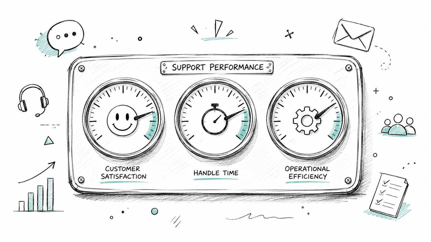
Boost Performance: Essential Customer Support KPIs 2026
A support manager opens the dashboard at the start of the week and sees a familiar mess. Ticket volume is up. Average handle time is down. First response looks acceptable. Customer comments feel mixed. The team says they're slammed, but the dashboard suggests things are under control.
That disconnect is why so many teams struggle with customer support KPIs. The numbers are visible, yet the operation still feels hard to steer.
Most support leaders don't have a measurement problem. They have an interpretation problem. A metric on its own doesn't explain whether the team is getting more efficient, whether customers are getting better help, or whether staffing and scheduling decisions are making the system harder to run.
The KPI Dashboard Dilemma
The usual dashboard looks impressive. It has charts, leaderboards, trend lines, and enough color coding to make everyone feel informed. Then a queue blows up, escalations pile up, and leaders discover that the dashboard was describing activity, not health.

That happens when customer support KPIs get treated like a report card instead of a diagnostic tool. Average handle time becomes a prize. CSAT becomes a vanity badge. Backlog becomes a weekly panic number. None of that helps unless someone can answer the harder question: what is the metric trying to reveal about capacity, process design, or customer friction?
A practical KPI program starts with three questions:
- What behavior does this metric reward: If a score improves, what will agents and managers do more often?
- What cost does it expose: Does it show wasted effort, repeat work, avoidable escalations, or poor routing?
- What action does it support: Can staffing, scheduling, training, or workflow change because of it?
A support team can hit response goals and still miss customer expectations if the wrong people are handling the wrong work. A team can also post decent CSAT while burning out agents through bad shift design and constant interruption.
Practical rule: If a KPI can't drive a staffing, scheduling, tooling, or coaching decision, it probably belongs lower on the dashboard.
This is where governance matters. Teams that want cleaner definitions and fewer metric arguments usually need HelpWithMetrics for audit-ready KPIs because the problem often isn't collection. It's inconsistency in how teams define and trust the number.
The same issue shows up in tooling decisions. Many leaders compare ticketing and reporting platforms before they think through the operating model that sits behind them. A broad help desk software comparison is useful, but software only helps when the metrics reflect the actual work the team is doing.
The Three Pillars of Support Metrics
A long KPI list creates noise. A balanced scorecard works better when support leaders group customer support KPIs into three pillars that reflect what matters operationally.
Customer quality
These metrics show how customers experience support. They don't measure internal busyness. They measure whether the interaction felt useful, easy, and confidence-building.
Common examples include CSAT, NPS, and FCR. Even though FCR affects efficiency, it belongs here too because customers feel the difference between getting a complete answer now and getting bounced around later.
Operational efficiency
This pillar shows how well the support machine runs. It focuses on speed, flow, and cost control.
AHT, first response time, mean time to resolution, backlog, and SLA compliance live here. These metrics help leaders identify queue pressure, bad routing, broken processes, and hidden work.
Team performance
This pillar is where many teams go too shallow. They track volume per agent but ignore the operating conditions that shape those results.
Metrics like schedule adherence, occupancy or utilization, escalation rate, and reopen rate help explain whether the team has the right coverage, enough breathing room, and the right level of expertise in the right shift windows.
Here's a practical reference model.
Essential Customer Support KPIs Overview
| KPI | Pillar | Formula | Typical Benchmark (B2B SaaS) |
|---|---|---|---|
| CSAT | Customer Quality | Positive satisfaction responses / Total survey responses | Varies by product complexity, channel mix, and survey timing |
| NPS | Customer Quality | Promoters minus Detractors | Best used as a directional loyalty signal, not a frontline support scorecard |
| FCR | Customer Quality | Issues resolved in first contact / Total issues received | Strong teams improve this steadily, but complex support will naturally vary |
| AHT | Operational Efficiency | Talk or handling time plus hold and after-contact work / Total interactions | Depends heavily on issue complexity and channel |
| First Response Time | Operational Efficiency | Total time to first reply / Total new tickets | Faster is usually better, but speed without resolution creates repeat work |
| MTTR | Operational Efficiency | Total resolution time / Total resolved tickets | Should reflect issue type and queue design, not one blended target |
| SLA Compliance | Operational Efficiency | Interactions resolved within SLA / Total SLA-tracked interactions | Useful only when SLA rules match customer priority and staffing reality |
| Backlog | Operational Efficiency | Open unresolved tickets at a point in time | Should remain controlled and segmented by age and severity |
| Schedule Adherence | Team Performance | Time worked as scheduled / Time scheduled | Critical for phone, chat, and scheduled support coverage |
| Escalation Rate | Team Performance | Escalated issues / Total issues handled | Healthy levels vary by support tier, training depth, and product maturity |
| Reopen Rate | Team Performance | Reopened tickets / Total resolved tickets | Lower is generally better if closures are legitimate |
| Utilization | Team Performance | Active support work time / Logged-in or available time | Useful for workforce planning, risky when used as a blunt performance weapon |
What balance looks like
A team that tracks one KPI from each pillar usually makes better decisions than a team tracking twenty in one category.
For example:
- Quality without efficiency creates kind but expensive support.
- Efficiency without quality creates fast but disposable support.
- Team metrics without context create resentment because agents get blamed for staffing and routing failures they don't control.
A good dashboard doesn't try to prove the team is working hard. It helps leaders see where the system is making good work difficult.
A Deep Dive into Customer Quality KPIs
Customer-facing metrics deserve more skepticism than they usually get. They look simple, but they're heavily shaped by timing, channel, and issue type. Used well, they reveal where support creates trust. Used poorly, they become a popularity contest.

CSAT tells the truth late and imperfectly
CSAT is best treated as interaction feedback, not universal proof of support quality. A customer may feel satisfied because the agent was responsive and clear, even if the underlying product issue remains painful. Another customer may leave a low score because the policy answer was correct but unwelcome.
That doesn't make CSAT weak. It makes it contextual.
Transactional CSAT works best right after a support event. Relationship-style satisfaction belongs in broader account or lifecycle feedback. Teams create confusion when they lump both together and expect one score to explain everything.
Useful CSAT review questions include:
- Was the issue resolved: Courtesy can lift sentiment for a while, but unresolved work comes back.
- Was the survey sent at the right moment: A survey before final closure measures impatience, not satisfaction.
- Was the sample skewed: Scheduled calls, chat, and email usually attract different expectations.
Leaders who want a sharper framework for interpreting satisfaction signals can use this guide for SaaS support leaders, especially when support is only one part of the customer experience.
NPS is broad sentiment, not queue management
NPS has value, but it shouldn't sit on an agent performance dashboard as if it explains daily support quality. It's a loyalty indicator tied to the broader relationship customers have with the company.
The categories are straightforward:
- Promoters signal confidence and advocacy.
- Passives are stable but not enthusiastic.
- Detractors indicate disappointment, mistrust, or unresolved friction.
What matters operationally is the pattern inside the feedback. If detractor comments keep pointing to handoffs, delayed follow-up, or poor ownership, support leaders have a service design problem. If they point to product reliability or billing, the support team shouldn't carry the metric alone.
FCR is where customer quality and operating discipline meet
First Contact Resolution is one of the strongest customer support KPIs because it bridges sentiment and cost. Customers like not having to come back. Support teams like not handling the same problem twice.
But FCR has a trap. Teams chase it too aggressively and start avoiding necessary escalation, specialist involvement, or deeper investigation. That inflates the appearance of resolution while pushing pain downstream.
A better way to use FCR is to review it alongside:
- Reopen patterns
- Escalation quality
- Customer comments
- Follow-up contacts on the same issue
Support leaders working on written channels should also pay attention to the quality of the actual reply. A rushed answer can technically count as a first response and still create another ticket. Stronger customer support email practices often improve both customer perception and resolution quality.
Measuring Your Support Engine's Efficiency
Efficiency metrics are the gauges on the support engine. They don't tell leaders whether customers love the service. They tell leaders whether the machine is burning too much fuel, moving work cleanly, and recovering from load without damage.

AHT and MTTR reveal different problems
Average Handle Time is interaction-level effort. It's useful for spotting process friction, poor knowledge access, or weak tooling. It becomes dangerous when leaders assume shorter always means better.
If AHT drops because agents are skipping discovery, pushing customers off the phone, or writing thin replies, the metric is lying. Cost goes up later through repeats, reopens, and escalations.
Mean Time to Resolution is broader. It reflects how long the customer lives with the issue from start to finish. This is often where staffing and routing failures show up first. A slow resolution cycle can come from queue design, specialist bottlenecks, bad triage, or weak handoffs between support tiers.
SLA, backlog, and first response expose capacity pressure
These metrics are less glamorous, but they tell leaders whether the operation is structurally under control.
A practical read on them looks like this:
- SLA compliance falling: Coverage may be misaligned with demand, or prioritization rules may be unrealistic.
- Backlog aging badly: Work isn't just accumulating. It's sitting in the wrong places too long.
- First response slipping: Intake capacity, triage discipline, or shift design is failing at the front door.
Scheduling becomes operational, not administrative. If the team can't put the right people on the right queue at the right time, efficiency metrics will keep deteriorating no matter how hard agents work.
Efficiency metrics only matter if they support resourcing decisions
The best use of operational KPIs isn't leaderboard management. It's workforce planning.
Leaders should ask:
- Which queues have the most variable load
- Which issue types consume the most specialist time
- Which time blocks create the biggest mismatch between demand and available skill coverage
- Which tools create extra handling steps
A solid support ticket system helps track the work itself, but teams still need to connect those data points to staffing models, shift patterns, and escalation paths. Otherwise, the engine gets measured without ever being tuned.
Common Pitfalls in KPI Measurement
Most KPI damage comes from good intentions. Leaders want accountability, visibility, and better planning. Then they choose one number, turn it into a target, and the system starts bending around the metric instead of the customer.

“When a measure becomes a target, it ceases to be a good measure.”
That warning fits support perfectly. AHT targets can produce rushed calls. FCR targets can discourage proper escalation. Cost-per-contact targets can justify thin staffing that makes everything slower and more stressful.
The mistakes that show up most often
- Weaponizing metrics against agents: Leaders blame individuals for results caused by poor routing, unstable staffing, or broken systems.
- Tracking vanity metrics: Teams celebrate output counts that don't map to customer outcomes or cost control.
- Ignoring segmentation: Blended metrics hide the difference between simple account questions and deep technical support.
- Using one metric alone: A single KPI rarely explains what changed or what to do next.
One common failure is rigidly rewarding low escalation rates. That sounds efficient. In practice, it can keep complex cases with generalists too long, delay specialist involvement, and frustrate customers who need a higher-skill answer.
Context is the difference between coaching and distortion
A metric should start a conversation, not end it.
When an agent's numbers shift, leaders should inspect the work mix, the channels handled, the schedule coverage, the handoff quality, and the systems available during that period. Without that context, the KPI program turns into a pressure system that teaches people how to game the dashboard.
Support teams don't usually fail because they aren't measured. They fail because the measurement system rewards the wrong trade-offs.
From Data to Decisions Tying KPIs to Action
A dashboard has no value until it changes a staffing plan, a workflow, or a customer journey. That's the break point for many support organizations. They can see the numbers. They can't reliably turn them into operational decisions.

What low scores often mean in the real operation
Low CSAT on scheduled calls often gets blamed on the agent who took the meeting. That's not always where the problem started. The customer may have booked with the wrong specialist, used an outdated booking link, landed in a slot with no prep context, or waited through a reassignment caused by shift changes.
Poor schedule adherence is another example. Leaders often read it as an agent discipline issue. Sometimes it is. Often it isn't. If the day is full of ad hoc meetings, direct calendar invites, side-channel bookings, and unmanaged follow-ups, adherence is going to look bad because the system is bypassing the workforce plan.
High escalation rates can also be misread. They may reflect weak frontline training, but they may also signal that intake is sending the wrong issue type to the wrong queue. A metric can't fix that. Routing design can.
The missing link is operational control
Scheduled support is where many KPI programs break down. Generic booking tools are fine for sales demos and basic appointments. They're a poor fit for support teams that need controlled access, rotating coverage, specialist availability, and queue integrity.
The operational failure pattern usually looks like this:
- Direct calendar exposure: Customers or internal teams start booking around the queue.
- Bookmarked links: Old access paths keep getting reused for the wrong issue types.
- Named-agent dependency: Work piles onto familiar specialists instead of flowing to the best available qualified person.
- Shift fragility: One absence creates reschedules, transfers, and rushed coverage patches.
Those issues don't stay isolated in scheduling. They show up in customer support KPIs almost immediately through lower satisfaction, weaker adherence, rising handling effort, and more internal coordination overhead.
The fix is rarely another report. It's controlled scheduling tied to team-based routing, expiring access paths, and assignment logic that respects live coverage conditions. Once that operational layer is stable, the metrics become far more useful because they're describing a designed system rather than a collection of workarounds.
Building a KPI-Driven Support Culture
A healthy KPI culture doesn't use metrics to scare people into movement. It uses metrics to make the work easier to understand, easier to improve, and cheaper to run well.
That starts with transparency. Agents should know why a metric matters, what affects it, and which problems belong to process design rather than individual effort. Leaders should review trends with context, especially when staffing, tooling, or scheduling conditions changed during the period.
Three habits make customer support KPIs more useful immediately:
- Start narrow: Pick one quality metric and one efficiency metric before building a larger scorecard.
- Review the why, not just the score: Use coaching sessions to explain what changed in the work, not only what moved on the dashboard.
- Connect metrics to operations: If the team's scheduling, routing, and coverage model is weak, the KPI program won't produce stable improvement.
Good support leaders don't ask whether the team hit the number. They ask whether the number helped the team run better.
Support teams that rely on scheduled calls, specialist handoffs, and rotating coverage need more than a generic booking link. Headset Army gives support organizations a team-first way to schedule customer calls without exposing agent calendars, creating queue bypass, or turning adherence into chaos. If scheduling friction is distorting support performance, it's worth a closer look.